The Trading Day: Breaking It Down
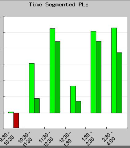
This is a monthly bar chart of my P&L by time segment. It allows me to monitor a few different aspects of my trading. First let me explain the layout of the chart which is quite simple.The bottom axis is the time frame in hours.The bars are layed out in two part,the first light green bar being my gross p&l,and the second dark green bar being my net p&l for that given time period.The pattern is the same for negative trades except the color being red,I think we all know what that means. The colors from lighter to darker tell me if I am making real profits, or am I churning taking too many trades,and only running up commissions during that time period. My style sometimes involves getting in and out a lot, so I really have to monitor my profits to commission ratios.I can also look at this at the end of the week,sometimes twice a week,and determine at what times of the day am I benefiting the most.Also at what times of the day am I losing,and what times am I churning.Combined with some other factors it is a fairly good indicator of my daily progress, and helps me determine better when I should lean into the market,and when I should back off.It's also pretty consistant in telling me that there are usually three good time periods for my trading. Right now by looking at the chart those time periods seem to be after the first hour, until about noon,then the mid afternoon,and finally the last hour or so.These time frames of opportunity will change from time to time, that is why it pays to monitor your progress.Not all the work is done in realtime.Do your homework, that's how we become better traders, and make it all worth while.
posted by txtrader @ 4:16 AM
0 comments
![]()


0 Comments:
Post a Comment
<< Home